Design on paper, not on the computer.
If there's one thing I learned in art school, one thing my professors drilled into my head over and over again, it was to design on paper not on the computer. And in my experience I found that tip to be massively useful. I've worked both ways hundreds of times. The results are always better on paper.
I've found that when I design on the computer, I tend to think like the computer. I tend to want to do things the way the computer wants to design things. The computer wants to draw rectangles and equilateral triangles. The computer has a million fonts, and for some reason wants to use Myriad for everything. The process slows you down. I have to go through so many menus, options, tools, and set up, that the ideas take longer to get out of my brain and onto the screen.
When I design on paper, the experience is much more fluid. If I want to draw a jelly bean shape, it takes one fluid motion from the shoulder to the paper. If I want to draw a jelly bean shape on the computer, I can use the draw tool, but it's very imprecise. I can draw a circle, and then use the indirect selection tool to select a point and move it in and use the anchor point tool to adjust the curve which is precise, but slooooooow. By the time I've made the jelly bean I've forgotten the original concept.
A couple loose scribbles go a long way.
Another major drawback to designing on the computer is, it's just too precise. A loose scribble can give you a sense of space, proportion, and balance, without distracting you with color choices, typography, and stylization. If you must design on the computer without designing on paper first, I recommend designing in a sketchy way. Meaning use gray boxes instead of photos, use a stupid font like comic sans, draw basic shapes in monotone colors for logos, in fact, don't use color at all. Design everything in black, white, and gray. Use dummy text. And stand back and squint your eyes. Don't sit too close to the monitor.
Designing with your hand is still the best (not always, but most of the time). But, one technique I have adopted to make my sketching better and quicker, is to use templates. There's nothing wrong with drawing sketchy boxes as your thumbnails, but when designing something for a specific size, like an 8.5 by 11 in. document, having a template handy, can speed up your workflow, make your sketches much more accurate, and prevent design problems down the road. For example, your thumbnail might be a little more narrow than actual letter size. So, when you get to the computer, and start laying it out for real, It doesn't look as good. It doesn't fill the space as nicely as the thumbnail sketch you made on paper. If you start with the correct ratio, you can avoid this problem later
Sketching makes your designs better. Sketching with templates makes your sketches better.
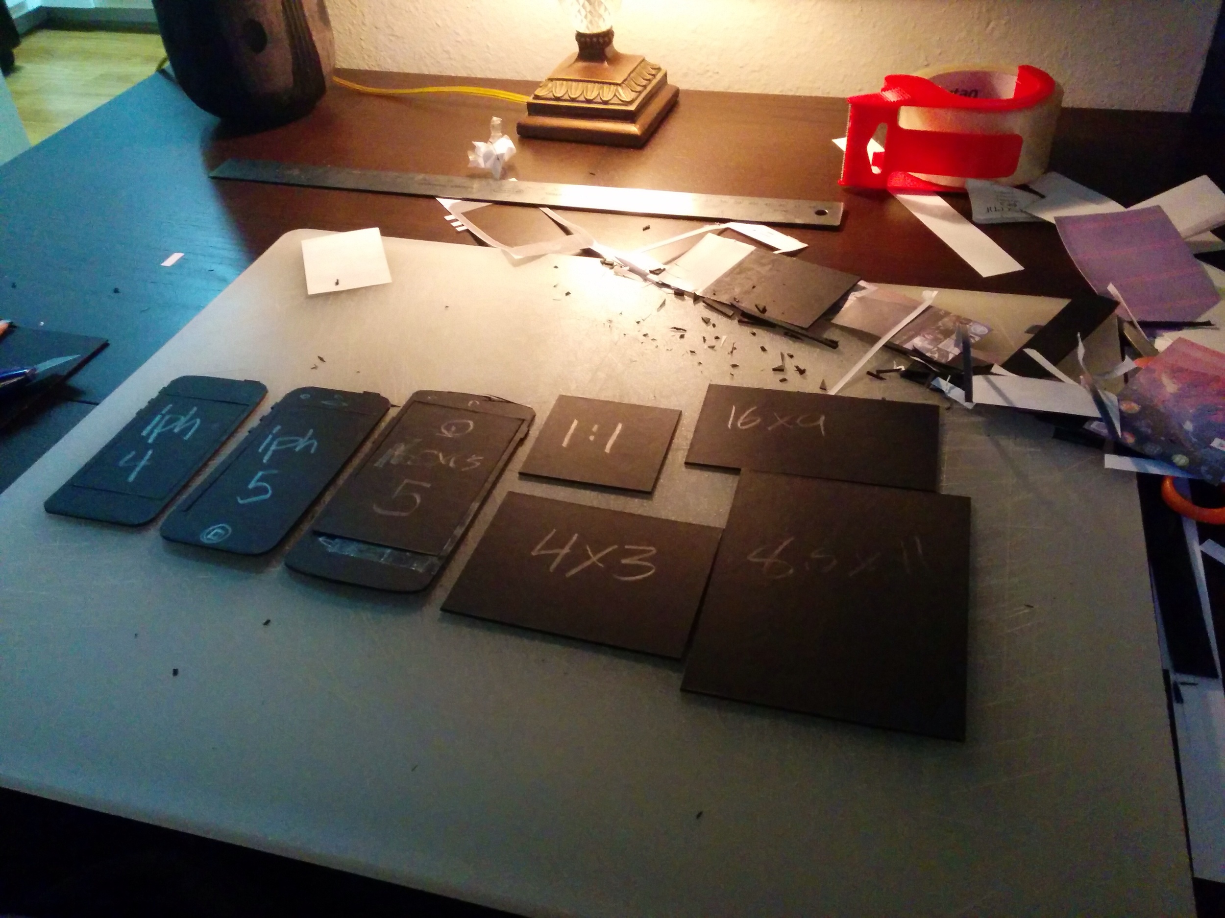
I've come across .pdfs you can download, on another blog, that are templates of iPhones. Printing out templates doesn't fit we'll with my workflow. I prefer to not have a bunch of loose leaf papers to track down, as well as preferring the tooth and size of my sketchbook paper. The templates I'm using are ones I cut out of matboard. Here's how you can make a set for yourself.