
Work in progress screen grabs of a new project. More to come later . . .
- J
graphic design


Work in progress screen grabs of a new project. More to come later . . .
- J

Easily drag and drop user profile pictures to your document or layers palette.
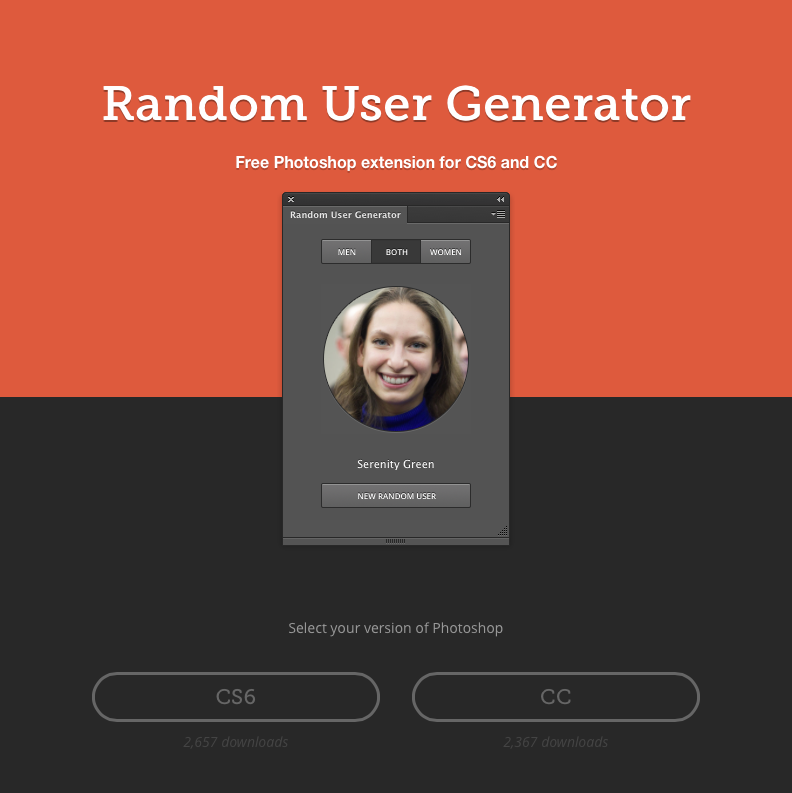
Click to go to randomuser.me
I found this little plug-in via the Smashing Magazine Facebook page and it's really handy! Installation is super easy. The functionality is pretty nice. Just drag and drop the images and copy and paste the text. Nice.
I love it, and I have a few suggestions for a future release. Firstly, I would like the UI of the plugin to match all the color schemes Photoshop has available. As seen in my screenshot above. The color scheme of the plugin doesn't match the color scheme I set in the preferences.
I'd also like to be able to specify age ranges. Random, Male, Teenager for example.
And the more users the better. I hit the same users pretty frequently.
All in all, it's awesome and a real time saver if I don't require a specific age or lifestyle. I've also used it just for the names, which is handy. There are many websites that do this, but it's quicker to have the ability in-app.
Design on paper, not on the computer.
If there's one thing I learned in art school, one thing my professors drilled into my head over and over again, it was to design on paper not on the computer. And in my experience I found that tip to be massively useful. I've worked both ways hundreds of times. The results are always better on paper.
I've found that when I design on the computer, I tend to think like the computer. I tend to want to do things the way the computer wants to design things. The computer wants to draw rectangles and equilateral triangles. The computer has a million fonts, and for some reason wants to use Myriad for everything. The process slows you down. I have to go through so many menus, options, tools, and set up, that the ideas take longer to get out of my brain and onto the screen.
When I design on paper, the experience is much more fluid. If I want to draw a jelly bean shape, it takes one fluid motion from the shoulder to the paper. If I want to draw a jelly bean shape on the computer, I can use the draw tool, but it's very imprecise. I can draw a circle, and then use the indirect selection tool to select a point and move it in and use the anchor point tool to adjust the curve which is precise, but slooooooow. By the time I've made the jelly bean I've forgotten the original concept.
A couple loose scribbles go a long way.
Another major drawback to designing on the computer is, it's just too precise. A loose scribble can give you a sense of space, proportion, and balance, without distracting you with color choices, typography, and stylization. If you must design on the computer without designing on paper first, I recommend designing in a sketchy way. Meaning use gray boxes instead of photos, use a stupid font like comic sans, draw basic shapes in monotone colors for logos, in fact, don't use color at all. Design everything in black, white, and gray. Use dummy text. And stand back and squint your eyes. Don't sit too close to the monitor.
Designing with your hand is still the best (not always, but most of the time). But, one technique I have adopted to make my sketching better and quicker, is to use templates. There's nothing wrong with drawing sketchy boxes as your thumbnails, but when designing something for a specific size, like an 8.5 by 11 in. document, having a template handy, can speed up your workflow, make your sketches much more accurate, and prevent design problems down the road. For example, your thumbnail might be a little more narrow than actual letter size. So, when you get to the computer, and start laying it out for real, It doesn't look as good. It doesn't fill the space as nicely as the thumbnail sketch you made on paper. If you start with the correct ratio, you can avoid this problem later
Sketching makes your designs better. Sketching with templates makes your sketches better.
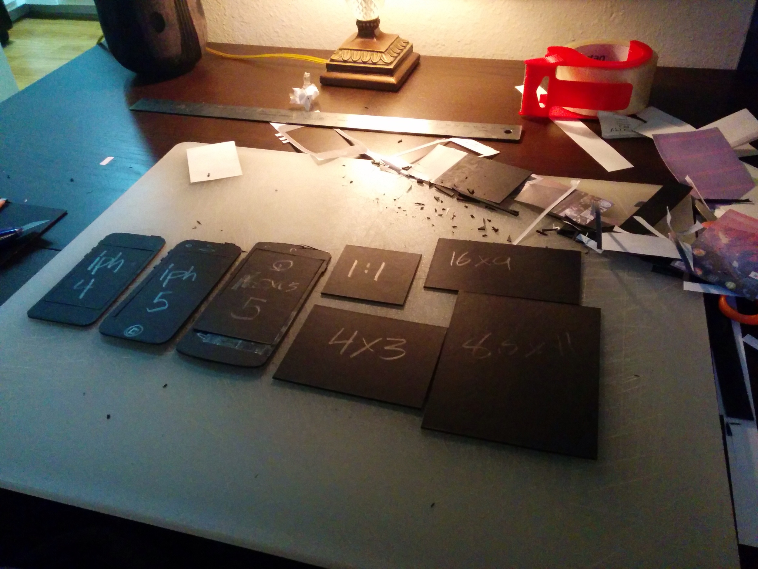
I've come across .pdfs you can download, on another blog, that are templates of iPhones. Printing out templates doesn't fit we'll with my workflow. I prefer to not have a bunch of loose leaf papers to track down, as well as preferring the tooth and size of my sketchbook paper. The templates I'm using are ones I cut out of matboard. Here's how you can make a set for yourself.

In this example, I'm creating an iPhone 4S & 5S, a Nexus 5, an 8.5 x 11 in., a 4:3, a 16:9, and a 1:1 ratio template. The 16:9 template is for creating thumbnails for video and tablets. The 4:3 is used for iPad layouts. The others are pretty obvious.

I'm using a scrap piece of matboard for my substrate. You may of course use whatever you like. If anybody has a spare laser cutter laying around, I'd love to make some templates out of stainless steel.

Using a box cutter I'm not just cutting a window, but the phone casing and buttons. I feel it's important to include the casing as it gives you a better feel of the sketch in context. The buttons, besides looking nice, it's helpful to know how the design will work with the physical object. For example, the iPhone placement of the home button and power button jives with a three column layout, but a four column layout would bisect the power button in an odd way. You may never think about these kind of details without seeing your designs in context. Similarly, a medium size circle, centered, bottom aligned on an iPhone would look much better if it's the same size as the device home button.

Be sure to give the screen edges a little extra thickness as they are the most fragile. And keep your windows (the part you cut out for the screen). The windows are useful for keeping the shape of the template when not in use, and can be used as a straight edge in a pinch.

Thanks for reading! If you already use templates in your workflow, I'd love to know what you're using why.
- Jordan
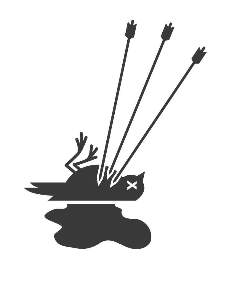
I found this icon of a Dead Bird while surfing around the Noun Project, and felt like it wasn't quite dead enough.
Now it's very dead . . .
Dead Bird designed by Luis Prado from The Noun Project
After Valentines, I'll be a free agent. My contract with SixDI will be on hold, maybe? They're in-between clients atm, so I'm looking for new opportunities in the ATX area. Know any good gigs send em my way!

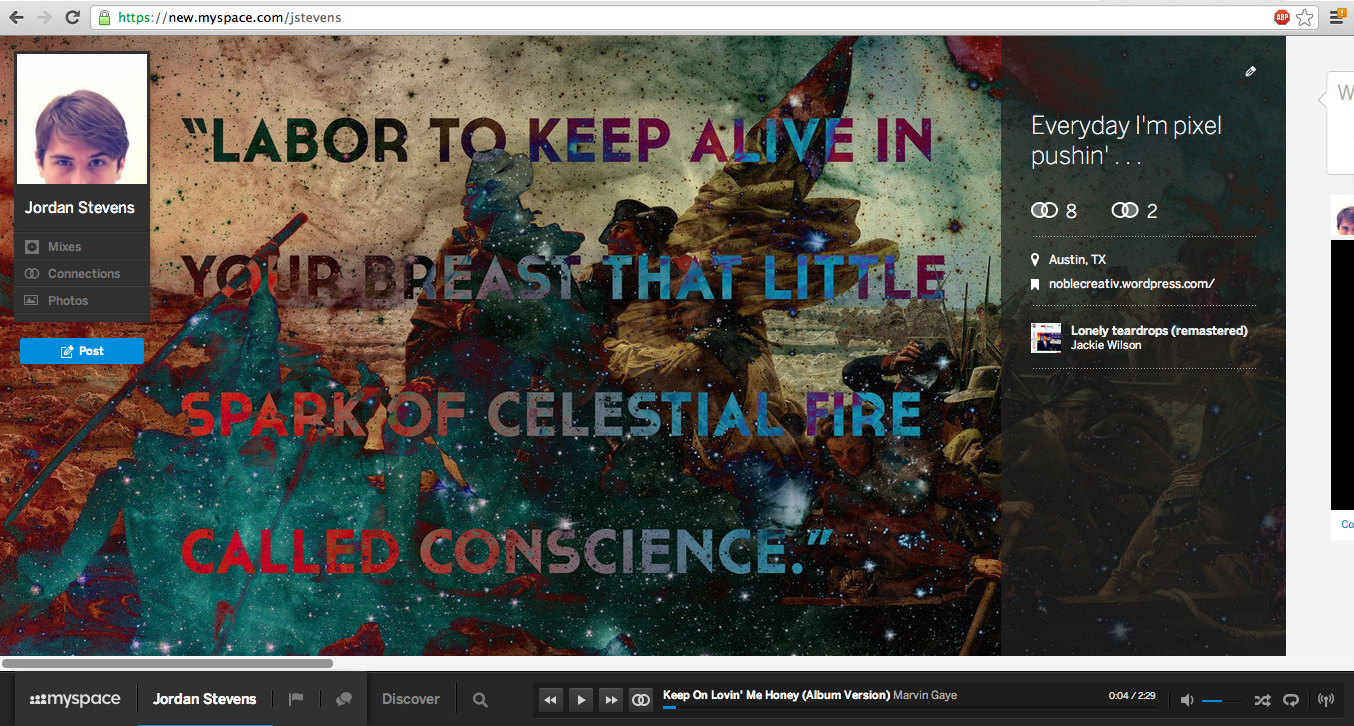 So, I know the new Myspace is getting alot of bad reviews, and you can read all about it almost anywhere you search, but I like it!
It basically combines all the best features of music sites I use everyday into one. And there are no ads! There's lots of paid for content when you browse the Discover function, but that is soooo much better than sidebar ads and promoted content in your feed like Facebook and Youtube, or skins and commercial breaks like on Pandora and Grooveshark. I like filling up my queue with full albums and shuffling it up, or browsing mixes. The affinity score is neat. I also like the idea of a social site that is music specific.
The design is slick, but doesn't work super smooth on a trackpad, and I've encountered two glitches so far. But it's a beta . . .
So far, I like it!
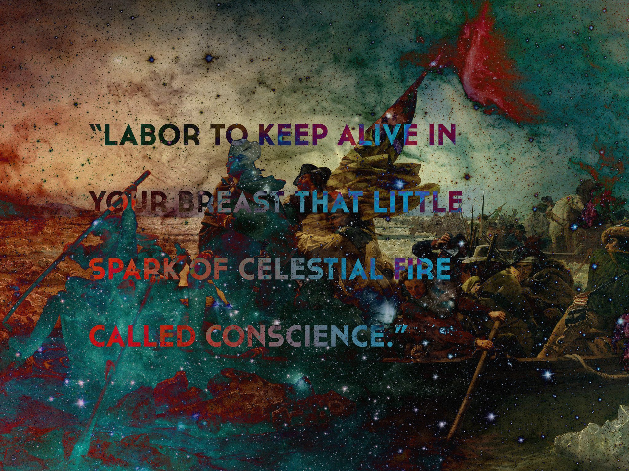
Here's a pic of my cover photo:
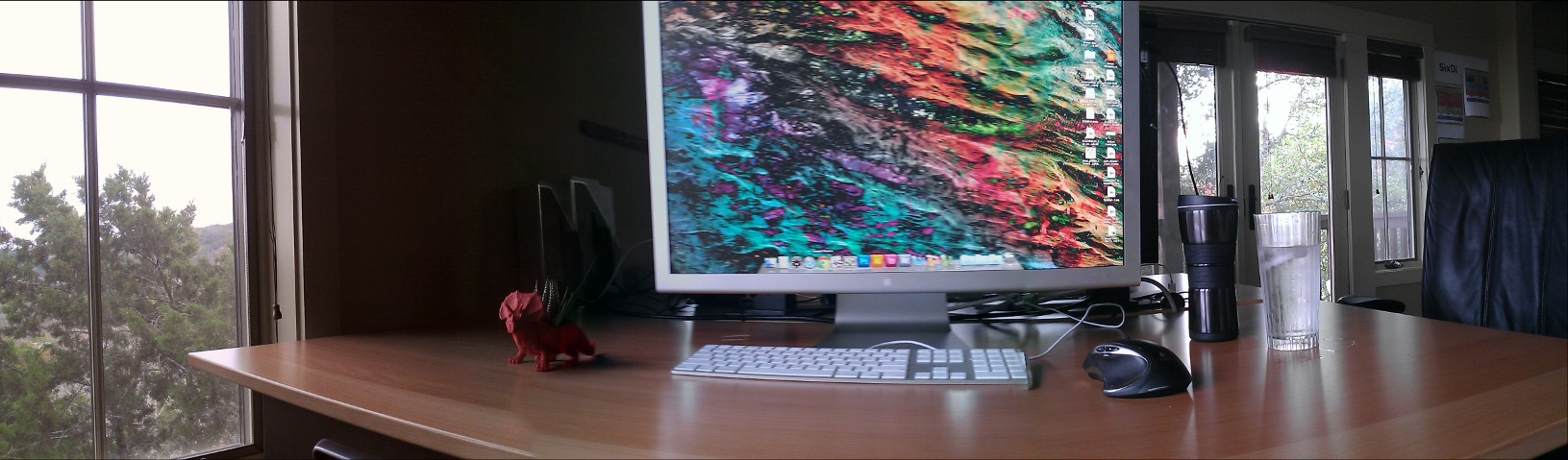
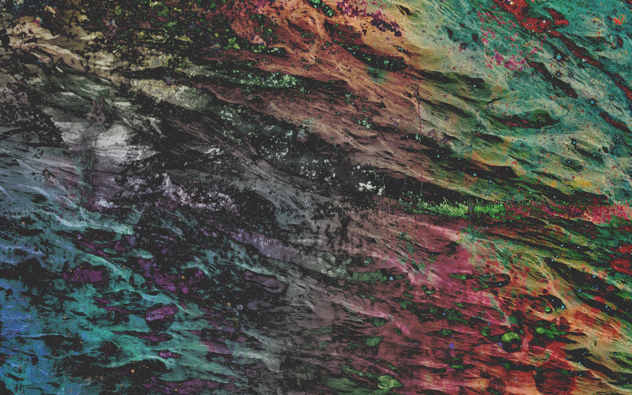 Current desktop wall paper, made from a photo of mars, a Hubbell telescope picture of stars, and a flickr photo of a tree and grass ;)
So me n Myrr moved to Austin in August and I found a job as a Graphic Designer with a company called SixDI about two weeks later. I got very lucky! I think the only reason I got a call back was because I applied to the company three times. So far, work has been good, and the company is growing, and I'm staying very busy . . . .